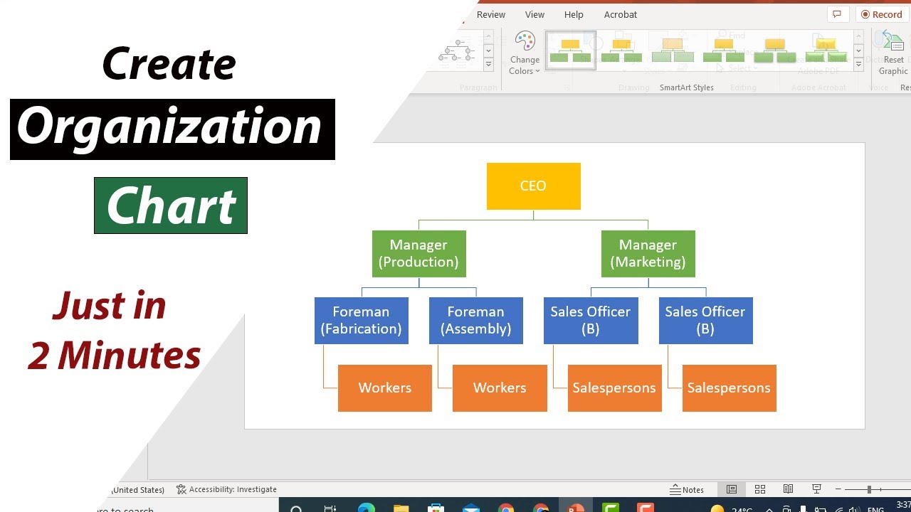
Image source: YouTube
Published on June 1, 2026
To prepare an organisation chart in PowerPoint quickly, use the built-in SmartArt feature:
For highly complex matrix structures or dotted-line reporting, you will need to bypass SmartArt and use manual shapes with elbow connectors, which we detail below.
When tasked with mapping out a company's reporting structure, professionals often debate whether to use Excel, specialized HR software, or presentation tools. While dedicated platforms like Organimi or Visio are excellent for live, dynamic databases, PowerPoint remains the undisputed standard for visualizing company hierarchy in corporate environments.
The primary reason for this dominance is accessibility and presentation-readiness. An organizational chart is rarely viewed in a vacuum; it is typically presented during board meetings, embedded in new hire onboarding decks, or shared in company-wide all-hands meetings. PowerPoint allows you to seamlessly integrate this visual data directly into the narrative flow of your presentation without requiring your audience to log into third-party software or squint at a massive, unformatted Excel spreadsheet.
Furthermore, there is a distinct psychological impact associated with a clear, well-designed hierarchy. According to presentation design experts at PresentationLoad, a visually appealing org chart does more than just show who reports to whom. It establishes role clarity, reduces internal friction regarding decision-making authority, and boosts team morale by clearly illustrating paths for career progression. PowerPoint provides the exact typographical and branding controls needed to make these charts look authoritative and aligned with your company's visual identity.
However, PowerPoint is inherently static. It provides a "snapshot in time" of your organization. If your company experiences high turnover or rapid restructuring, maintaining a PowerPoint chart requires manual updates. Therefore, understanding the most efficient ways to build and edit these charts—whether through automated SmartArt or precise manual methods—is a critical skill for any manager, HR professional, or consultant.
If your primary goal is speed and your organizational structure follows a standard, top-down hierarchy without complex matrix reporting, PowerPoint's SmartArt engine is the most efficient tool at your disposal. You can generate a clean, professional chart in under two minutes if you understand how to leverage the tool correctly.
Begin by navigating to a blank slide. Go to the Insert tab on the top ribbon, locate the Illustrations group, and click SmartArt. A dialog box will appear. On the left-hand menu, select Hierarchy. You will see several layout options, but the most reliable and widely used is the very first option: Organization Chart. Select it and click OK. A basic template with a few placeholder boxes will appear on your slide.
The most common mistake users make when building an org chart in PowerPoint is clicking directly into the individual boxes to type names, and then right-clicking boxes to add new shapes. This method is incredibly slow and often breaks the layout engine.
Instead, you must use the Text Pane. If the Text Pane is not visible, click the small arrow icon on the middle-left edge of the SmartArt bounding box. This opens a bulleted list interface next to your chart. According to consulting design experts at Deckary, typing your data into this Text Pane is up to five times faster than interacting with the shapes directly.
Once you are in the Text Pane, you can build the entire structure without ever touching your mouse. The SmartArt engine translates the indentation of your bullet points into the vertical hierarchy of the chart. Memorize these three keyboard shortcuts:
While the standard SmartArt insertion method is fast, there is an advanced technique favored by power users that is even faster, especially when you need to import a large list of names from an email or a Word document. This is known as the "Bullet List Hack."
When you try to build a massive chart by adding shapes one by one inside the SmartArt engine, the software constantly tries to resize and reposition the boxes with every click. This can cause the program to lag and leads to the frustrating experience of "fighting the layout engine." The Bullet List Hack bypasses this entirely.
Instead of starting with SmartArt, start with a standard text box. Draw a large text box on your slide and simply type out your organization's hierarchy as a standard bulleted list. Use the Tab key to indent subordinates, just as you would in a Word document.
For example, your text box should look like this:
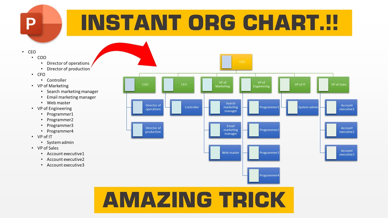
Once your entire list is typed and properly indented, highlight all the text inside the box. Right-click the highlighted text, hover over Convert to SmartArt in the context menu, and select the Organization Chart icon. PowerPoint will instantly read your indentations and generate the entire complex chart in a single second. Because the engine only has to calculate the layout once, rather than recalculating after every single name is added, the result is perfectly spaced and completely lag-free.
SmartArt is fantastic for speed, but it has severe limitations. It struggles with complex matrix structures, it forces all boxes to resize uniformly (even if you don't want them to), and it can be difficult to align with strict corporate branding guidelines. When you are preparing a deck for a high-stakes board meeting or a client deliverable, SmartArt can quickly become a liability.
In these scenarios, management consultants at top-tier firms abandon SmartArt entirely and build their organizational charts manually using standard PowerPoint shapes and connectors. While this takes significantly longer, it guarantees pixel-perfect precision and total control over the visual output.
Before drawing a single box, you must prepare your slide for precision alignment. Navigate to the View tab on the ribbon and check the boxes for Guides and Gridlines. This will overlay a visual grid on your slide, ensuring that you can align your shapes perfectly to the center of the page.
The secret to a consulting-grade chart is consistency. You should never draw multiple boxes; you draw one perfect "Master Box" and duplicate it. According to professional presentation designers, a standard 16:9 PowerPoint slide accommodates these specific dimensions best:
Once your Master Box is created, select it and press Ctrl + D (Duplicate) to create exact copies for every person in the organization. Place them roughly where they belong on the slide.
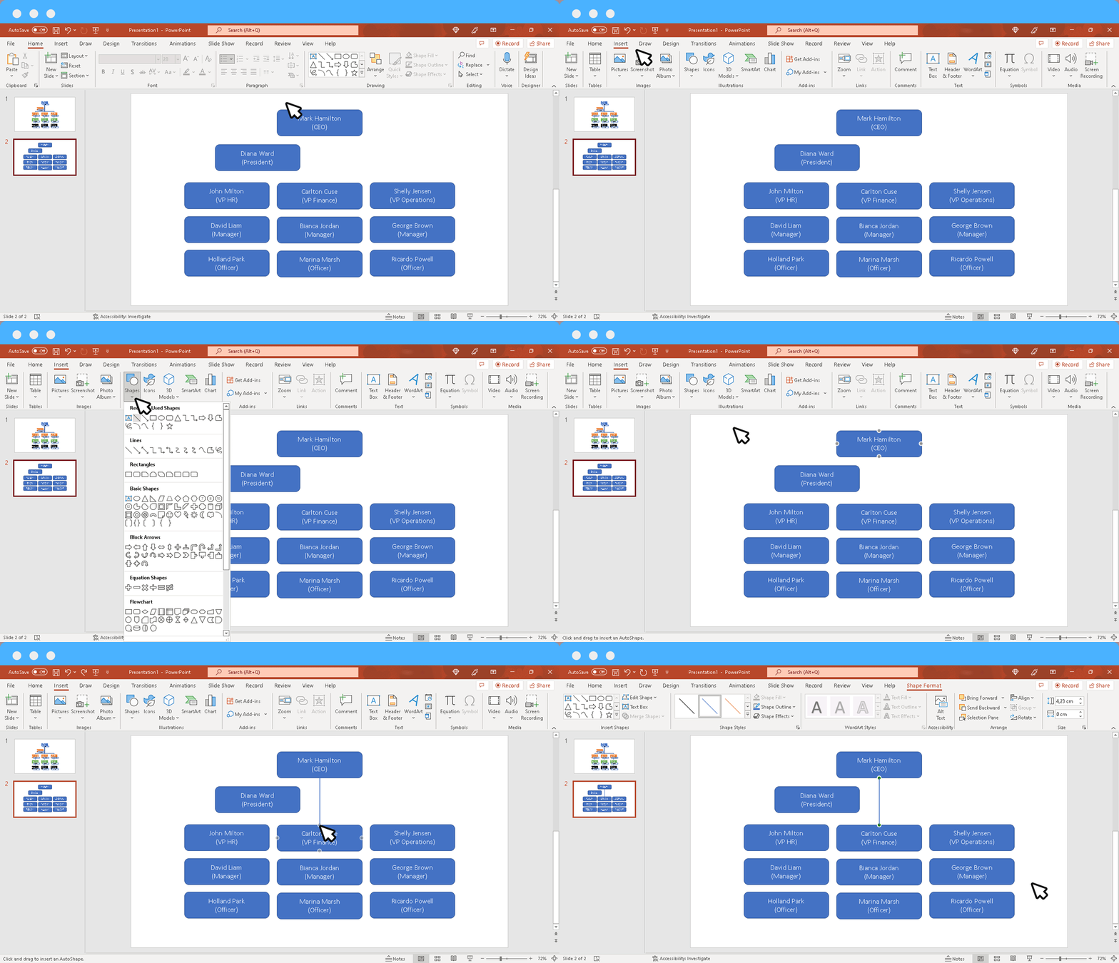
The most critical part of a manual org chart is how you connect the boxes. Do not use standard straight lines. You must use Elbow Connectors (found in the Shapes menu under Lines). Elbow connectors automatically draw the rigid, 90-degree angles required for professional hierarchy charts.
When you click and drag an elbow connector toward a shape, you will see small grey anchor points appear on the edges of the box. You must drag the end of the line directly onto one of these anchor points until it turns green. A green dot signifies that the line is "locked" to the shape. If you need to move the box later to make room for a new hire, the line will stretch and travel with the box automatically. If the dot remains white or grey, the line is just floating on top of the box and will disconnect as soon as you move anything.
Once your boxes and lines are roughly in place, use PowerPoint's alignment tools to clean up the chart. Select an entire horizontal row of peers (e.g., all the Vice Presidents) by holding the Shift key and clicking each box. Go to Shape Format > Align, and select Align Middle to ensure they are perfectly horizontal. Then, while they are still selected, click Distribute Horizontally. This will calculate the exact mathematical distance between each box and space them out perfectly evenly across the slide.
Modern organizations rarely operate in a strict top-down hierarchy. Employees often report to multiple managers, project leads, or have specialized assistant roles. Visualizing these nuances is where standard tools often fail, requiring specific troubleshooting techniques.
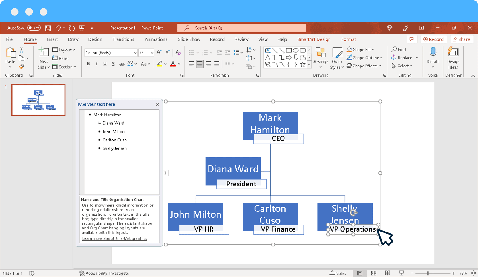
An Executive Assistant or a Chief of Staff does not sit in the standard hierarchy; they sit off to the side of the executive they support. If you are using SmartArt, you cannot achieve this using the standard Tab key method.
To add an assistant in SmartArt, click on the manager's box. Then, navigate to the SmartArt Design tab on the ribbon. On the far left, click the drop-down arrow next to Add Shape and select Add Assistant. This will generate a specialized L-shaped connector that branches off the main vertical line, visually indicating a staff role rather than a line management role.
In matrix organizations, an employee might have a solid line to their functional manager (e.g., Head of Engineering) and a dotted line to a product manager. Unfortunately, SmartArt does not natively support dotted lines for individual connections; if you change the line style in SmartArt, it changes every line in the entire chart.
To solve this, you have two options:
If a team reports equally to two co-directors, do not draw two separate lines to every single subordinate. Instead, place the two co-directors' boxes side-by-side. Draw a manual bracket shape (found in the basic shapes menu) connecting the bottom of both boxes, and then drop a single vertical line down from the center of that bracket to the subordinates below. This visually groups the leadership while keeping the chart uncluttered.
One of the most common mistakes when preparing an organisation chart in PowerPoint is attempting to fit a 50-person company onto a single slide. This results in what presentation designers call "The Wall of Boxes"—a slide where the font size is reduced to 6pt, making it entirely unreadable for anyone sitting past the first row of the boardroom.
To handle large organizations, you must employ the Drill-Down Strategy. This involves breaking your organization into a cohesive, interactive directory across multiple slides.
Slide 1 should be your "Master Chart." This slide should only display the C-Suite and the heads of each major department (e.g., VP of Marketing, VP of Sales, VP of Engineering). Do not include any managers or individual contributors on this slide. The goal is to provide a high-level overview of the company's functional areas.
Next, create separate, dedicated slides for each department. Slide 2 becomes the Marketing Org Chart, Slide 3 becomes the Sales Org Chart, and so on. On these sub-slides, you have plenty of room to map out the managers and individual contributors.
To connect them, return to your Master Chart. Right-click the box for the "VP of Marketing" and select Link (or Hyperlink). In the dialog box, choose Place in This Document, and select Slide 2 (the Marketing slide). Repeat this process for every department head.
When you are in Presentation Mode, you can now click on any department head on the Master Chart, and PowerPoint will instantly jump to that specific department's detailed org chart. To ensure a smooth user experience, you must add a "Back to Master" button on every sub-slide. Insert a small icon (like a house or a back arrow) in the top right corner of your department slides, right-click it, and hyperlink it back to Slide 1. This allows you to seamlessly navigate up and down the corporate hierarchy during a live presentation without ever breaking the flow.
Choosing the right method for your PowerPoint org chart depends entirely on your specific constraints regarding time, complexity, and branding requirements. Use the decision framework below to determine the best approach for your current project.
| Criteria | SmartArt Engine | Manual Shapes & Connectors | Pre-Built Templates |
|---|---|---|---|
| Speed of Creation | Very High (Under 2 minutes) | Low (Requires meticulous alignment) | Medium (Requires replacing placeholder text) |
| Visual Customization | Low (Forces uniform box sizes and spacing) | Very High (Pixel-perfect control over every element) | Medium (Depends on the template's flexibility) |
| Matrix / Dotted Line Support | Poor (Cannot format individual lines easily) | Excellent (Can draw custom dashed connectors anywhere) | Poor (Usually built on standard SmartArt frameworks) |
| Ease of Future Updates | Excellent (Auto-resizes when new names are added) | Hard (Adding one person may require shifting 10 boxes) | Medium (May break if you exceed the template's capacity) |
As a general rule, use SmartArt for internal team meetings, rough drafts, or rapidly changing departments. Transition to Manual Shapes when preparing final deliverables for clients, board members, or official company handbooks where aesthetic precision is paramount.
While an organizational chart is fundamentally a directory of "who's who," treating it merely as a phonebook ignores its strategic value. When prepared correctly in PowerPoint, your org chart can serve several critical operational functions.
According to corporate training insights, an org chart is one of the most important documents a new hire receives. It shouldn't just show them who their boss is; it should visually map out their "Path of Progress." By clearly delineating the hierarchy from Junior to Senior to Lead roles, the chart implicitly communicates the company's career ladder, which has been shown to improve early retention and role clarity.
Org charts are frequently used by IT and compliance departments to audit data security tiers. By color-coding the boxes in your PowerPoint chart based on security clearance levels (e.g., Red for executive financial access, Yellow for managerial access), you can quickly identify if someone is positioned in a role that grants them inappropriate access to sensitive company documents.
When you map out a complex matrix manually, visual imbalances become immediately apparent. If you notice that one mid-level manager has twelve direct reports while their peer only has three, your org chart has just identified a "Single Point of Failure" and a likely bottleneck in your operational workflow. Visualizing the structure allows leadership to proactively reallocate resources before burnout occurs.
Preparing an organisation chart in PowerPoint doesn't have to be a frustrating battle with formatting. By understanding the strengths and limitations of the software's built-in tools, you can build professional, accurate hierarchies in a fraction of the time.